Color (American English) or colour (British English) (see spelling differences) is the visual perceptual property corresponding in humans to the categories called red, blue, yellow, and others. Color derives from the spectrum of light (distribution of light power versus wavelength) interacting in the eye with the spectral sensitivities of the light receptors.
Color is everywhere, from the clothes we wear to the walls we paint. It’s a visual sensation caused by the reflection or transmission of light. The human eye can distinguish between millions of colors.
In this post we'll cover:
- Exploring the Physical Properties of Matter
- Primary Colors: The Building Blocks of Color
- Mastering the Art of Mixing Colors
- Colors and Their Impact on Our Moods
- Choosing the Perfect Paint Color: A Methodical Approach
- Step 1: Consider the Mood You Want to Achieve
- Step 2: Test the Paint in Natural Light
- Step 3: Consider the Finish or Sheen
- Step 4: Pick a Primary Color and Add a Bit of Contrast
- Step 5: Keep the Style of Your Home in Mind
- Step 6: Don’t Be Afraid to Switch Things Up
- Step 7: Clean Up and Ground the Space
- Step 8: Offer a Nice Flow Between Parts of the Room
- Conclusion
Exploring the Physical Properties of Matter
When we talk about the physical properties of matter, we are referring to the characteristics that can be observed or measured without changing the substance’s identity. These properties include:
- Density: the amount of mass per unit volume of a substance
- Melting and boiling points: the temperature at which a substance changes from a solid to a liquid or a liquid to a gas
- Color: the observable characteristic of matter that is reflected by the substance
- Hardness: the resistance of a material to being scratched or dented
- Conductivity: the ability of a substance to conduct electric current
- Impedance: the measure of opposition to electric current flow
Physical vs. Chemical Properties
It’s important to note that physical properties are different from chemical properties. While physical properties can be observed or measured without changing the substance’s identity, chemical properties describe how a substance interacts with other substances to produce new substances. Some examples of chemical properties include:
- Reactivity: the ability of a substance to react with other substances to produce new substances
- Flammability: the ability of a substance to burn in the presence of oxygen
- Corrosiveness: the ability of a substance to corrode or dissolve other materials
Primary Colors: The Building Blocks of Color
When talking about color, the first thing that comes to mind is the primary colors. These are the basic colors that cannot be created by mixing other colors. The three primary colors are red, blue, and yellow. These colors are considered the building blocks of color because they can be combined to create all other colors.
How to Mix Primary Colors
Mixing primary colors is essential in creating a wide range of colors. When you mix two primary colors, you get a secondary color. For example, when you mix red and blue, you get purple. When you mix blue and yellow, you get green. When you mix red and yellow, you get orange. Mixing all three primary colors together results in black.
The Role of White in Primary Colors
White is not considered a primary color, but it is an essential element in creating different shades of colors. Adding white to a color will result in a lighter shade, while adding black will result in a darker shade. This is known as tinting and shading.
Mastering the Art of Mixing Colors
Mixing colors is an essential skill for any artist or designer. It requires practice and experimentation to gain a solid understanding of the process. Here are some essential points to keep in mind when starting:
- Red, blue, and yellow are the primary colors.
- All other colors are created through mixing primary colors in various combinations.
- Mixing any colors together will never create a primary color.
- Secondary colors are made when you mix two primary colors together—orange, green, and purple.
Tools and Techniques
To start mixing colors, you’ll need a few essential tools and techniques:
- A set of paints in different colors, including primary and secondary colors.
- White and black paint to lighten or darken colors.
- A palette to mix colors on.
- A brush or palette knife to mix colors.
- A piece of paper or canvas to test your mixes on.
Here are some techniques to help you mix colors effectively:
- Start with small amounts of paint and add more as needed.
- Add colors in a line to create a tonal scale.
- Mix cool and warm colors to create depth and contrast.
- Use a wide range of colors to create a wide range of shades.
- Experiment with different ratios of colors to create different mixes.
Playing with Colors
Mixing colors can be a fun and creative exercise. Here are some tips to help you get started:
- Spend plenty of time experimenting and trying different mixes.
- Don’t be afraid to add an extra color or two to the mix.
- Keep in mind that certain colors require more force to mix than others.
- Be sure to mix colors well to avoid unwanted streaks or patches.
- Use complementary colors to create a strong contrast.
- Warm colors tend to advance, while cool colors tend to recede.
- Use earth tones to create a more natural look.
Matching Colors
Matching colors can be a bit tricky, but it’s an important skill to have. Here are some tips to help you match colors:
- Start by drawing a square of the color you want to match.
- Mix a few different shades of the color you want to match.
- Experiment with lightening or darkening the color to get the right shade.
- Use gouache or watercolor to create a more saturated color.
- Add layers of paint to create depth and contrast.
- Use a complementary color to highlight the color you want to match.
Creating a Perfect Mix
Creating the perfect mix requires patience and practice. Here are some tips to help you create a perfect mix:
- Start with a solid understanding of the color wheel and color theory.
- Experiment with different ratios of colors to find the right mix.
- Use a tonal scale to help you see the different shades of the mix.
- Keep in mind that adding white or black will change the hue of the mix.
- Use similar colors to create a harmonious mix.
- Cut back on the amount of paint you use to create a more subtle mix.
- Keeping a record of your mixes can help you recreate them in the future.
Colors and Their Impact on Our Moods
Colors play a significant role in our everyday lives. They influence the way we feel, the way we think, and the way we behave. Colors can create a certain mood, evoke a specific emotion, and even affect our physical well-being. In this section, we’ll take a closer look at how colors can impact our moods and why it’s important to consider them when designing or decorating.
Colors and Their Meanings
Colors are widely recognized as having certain meanings and associations. Here are some examples:
- Red: This color is often associated with passion, love, and excitement. It can also be seen as aggressive or intense.
- Blue: Blue is a cool color that is often associated with calmness, serenity, and stability. It can also be seen as sad or melancholic.
- Green: This color is often associated with nature, growth, and harmony. It can also be seen as envy or jealousy.
- Yellow: Yellow is a warm color that is often associated with happiness, optimism, and energy. It can also be seen as caution or cowardice.
- Purple: This color is often associated with royalty, luxury, and creativity. It can also be seen as mysterious or spiritual.
- Black: Black is often associated with darkness, mystery, and sophistication. It can also be seen as negative or depressing.
- White: White is often associated with purity, innocence, and simplicity. It can also be seen as cold or sterile.
Colors and Personal Preferences
Everyone has their own personal preferences when it comes to colors. Some people prefer warm, bright colors, while others prefer cool, muted tones. Here are some things to note:
- Personal preferences for colors can be influenced by a variety of factors, including culture, upbringing, and personal experiences.
- Certain colors may be more popular or trendy at certain times, but personal preferences can vary widely.
- It’s important to choose colors that you personally enjoy and feel comfortable with, rather than simply following the latest trends or fads.
Colors and Design
Colors play a powerful role in design, whether it’s in graphic design, fashion, or interior design. Here are some things to consider:
- Colors can be used to create a specific mood or atmosphere in a design.
- Different color combinations can create different effects and evoke different emotions.
- Colors can be used to highlight certain elements of a design or to create contrast.
- When choosing colors for a design, it’s important to consider the overall message or feeling you want to convey.
Colors and Expert Advice
If you’re not sure which colors to choose for a specific project or design, it can be helpful to ask an expert for advice. Here are some tips:
- Designers and color experts can provide valuable insights into which colors work well together and which ones to avoid.
- They can also help you choose colors that are appropriate for your target audience or demographic.
- Examples of color palettes and combinations can be helpful in visualizing how different colors will work together.
Choosing the Perfect Paint Color: A Methodical Approach
Step 1: Consider the Mood You Want to Achieve
Before you start browsing through paint swatches, think about the mood you want to create in the room. Do you want it to feel cozy and warm or bright and airy? Remember that different colors can evoke different emotions, so keep that in mind when making your decision.
Step 2: Test the Paint in Natural Light
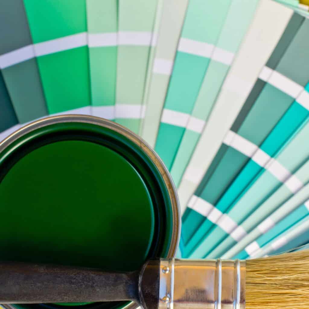
Once you have a couple of colors in mind, it’s time to test them out. Don’t rely on the tiny paint chips in the store – they can look very different in your home’s lighting. Instead, pick up a few sample pots and paint large swatches on the wall. Allow the paint to dry completely and then observe the colors at different times of the day to see how they look in natural light.
Step 3: Consider the Finish or Sheen
The finish or sheen of the paint can also have a big impact on the overall look of the room. There are typically four different finishes to choose from: flat, eggshell, satin, and semi-gloss. Each finish offers different effects and covers different areas better than others. Keep in mind that the higher the sheen, the more shiny and reflective the paint will be.
Step 4: Pick a Primary Color and Add a Bit of Contrast
If you’re having trouble deciding on a color, start with a primary color and then add a bit of contrast. For example, if you love blue, consider adding a slightly warmer shade of blue to the mix. This will bring some consistency to the room while still allowing you to play with different shades.
Step 5: Keep the Style of Your Home in Mind
While it’s important to choose a color that you love, it’s also important to keep the style of your home in mind. If you have a highly modern home, a bright and bold color might work well. However, if you have a more traditional home, a more muted color might be a better fit.
Step 6: Don’t Be Afraid to Switch Things Up
If you’re feeling stuck or unsure about a color, don’t be afraid to switch things up. Try a different shade or finish to see if it works better. Remember that paint is an easy and relatively inexpensive way to transform a room, so don’t be afraid to play around with different options.
Step 7: Clean Up and Ground the Space
Once you’ve decided on a color, it’s time to clean up and ground the space. This means making sure that the edges are clean and the paint covers the entire area evenly. If you’re not confident in your ability to handle this step, consider hiring a professional painter to serve as a guide.
Step 8: Offer a Nice Flow Between Parts of the Room
Finally, make sure that the color you choose offers a nice flow between different parts of the room. This means that the color should be consistent throughout the space and not too jarring when you move from one area to another. A series of paint strips can be helpful in achieving this consistency.
Conclusion
So, color is a combination of wavelengths of light reflected off objects. Color is an important part of our lives, from painting to clothing to art. It’s something we enjoy and appreciate, and now you know a little more about it. So go out and explore the world of color!

I'm Joost Nusselder, the founder of Tools Doctor, content marketer, and dad. I love trying out new equipment, and together with my team I've been creating in-depth blog articles since 2016 to help loyal readers with tools & crafting tips.